手机端首页仿写
步骤
1) html文档里写好header, main and footer.
2) link to css 文档,布局
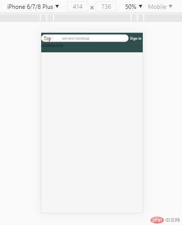
3) 添加内容 (后续)效果
代码html:
<title>手机端首页仿写</title>
<link rel="stylesheet" href="static/css/index.css" />
<link rel="stylesheet" href="static/css/reset.css" />
<link rel="stylesheet" href="static//icon-font/iconfont.css" />
<link rel="stylesheet" href="static/css/header.css" />
<link rel="stylesheet" href="static/css/footer.css" />
<link rel="stylesheet" href="static/css/nav.css" />
</head><body>
<div class="header">
<div class="search">
<div class="logo">Top</div>
<div class="zoom iconfont icon-search"></div>
<input type="text" class="words" value="womens handbags" />
</div>
<a href="" class="login">Sign in</a>
</div>
<div class="main">HANDBAGS</div>
<div class="footer"></div>
</body>- 代码index.css
@import “reset.css”;
.header {
background: darkslategrey;
color: whitesmoke;
height: 4.4rem;
position: fixed;
left: 0;
top: 0;
right: 0;
z-index.100
}
.main {
position: absolute;
top: 4.4rem;
left: 0;
right: 0;
bottom: 4.4rem;
}
.footer {
background: darkslategray;
color: whitesmoke;
height: 4.4rem;
position; fixed;
left: 0;
bottom: 0;
right: 0;
}
- 代码index.css
代码header.css
.header .search {
flex: 6;
background-color: #fff;
border-radius: 3rem;
padding: 0.5rem;display: flex;
}
.header .search .logo {
color: #e43130;
font-size: 2rem;
flex: 0 1 4rem;
text-align: center;
line-height: 2rem;
}
.header .search .zoom {
color: #ccc;
flex: 0 1 4rem;
text-align: center;
line-height: 2rem;
border-left: 1px solid;
}
.header .search .words {
flex: auto;
border: none;
outline: none;
color: #aaa;
}- 代码footer.css
.footer {
display: flex;
justify-content: space-around;
align-items: center;
color: #666;
}
/ flex支持嵌套布局 /
/ flex的项目可以又是一个flex容器 /
.footer > div {
display: flex;
flex-flow: column nowrap;
/ 主轴垂直,那么交叉轴就是水平 /
align-items: center;
}
.footer > div .iconfont {
font-size: 2rem;
}
.footer > div > span {
font-size: 1rem;
}
.footer > div:hover {
cursor: pointer;
}
更多相关文章
- 2021必修 首门CSS架构系统精讲 理论+实战玩转蘑菇街
- Python可以比C++更快,你不信?
- 强大!用 60 行代码自动抢微信红包
- 弃繁就简!一行代码搞定 Python 日志!
- 2021-04-03:给定两个字符串str1和str2,想把str2整体插入到str1中的
- 祖传代码成山,怎么处理还不起的技术债?
- Top4 数据科学竞赛解决方案 | 附带报告+方案+代码讲解+数据集
- 20个Pandas代码 | 助力数据从业人员新征程!
- 2021年,开发者的落日