定位登录页面/flex布局
16lz
2022-01-23
定位
- position:relative; 相对定位
- position:absolute;绝对定位
- position:fixed;固定定位
登录页面
<style>*{padding:0;margin:0;box-sizing:border-box;}.container{width:100vw;height:100vh;background-color: #1E9FFF;position: relative;}.container .login{width: 30rem;height: 30rem;position: absolute;top: 50%;left: 0;right: 0;margin: 0 auto;margin-top: -15rem;background-color: #fff;border: 1px solid #fff;border-radius: 3px;box-shadow: 0 0 8px #eeeeee;padding: 1.5rem;}.container .login .login-title h1{color: #1E9FFF;font-size: 2.5rem;font-weight: bold;text-align: center;margin-bottom:1.5rem;}.container .login .form {position: relative;margin-bottom:1.5rem;}.container .login .form label {margin-bottom: 1.5rem;clear: both;position: absolute;left: 1px;top: 1px;width: 4rem;line-height: 4rem;text-align: center;color: #d2d2d2;}.container .login .form input {padding-left: 4rem;display: block;width: 100%;height: 4rem;line-height: 4rem;background-color: #fff;border-radius: 2px;border:1px solid #ccc;}.container .login .form input:focus{outline: 0px;box-shadow: 0 0 10px #1e9fff;}.container .login .form img{background-color: bisque;position: absolute;right: 0px;top: 0px;width: 10rem;height: 4rem;}.container .login .form .btn{display: block;height: 4rem;line-height: 4rem;border: 0px;background-color: #1E9FFF;color: #fff;text-align: center;font-size: 1.4rem;border-radius: 2px;cursor: pointer;width: 100%;}</style><div class="container" ><div></div><div class="login" ><div class="login-title" ><h1>登录</h1></div><form action=""><div class="form"><label class="iconfont icon-yonghu" for="username"></label><input type="text" name="username" placeholder="用户名" value=""></div><div class="form"><label class="iconfont icon-mima" for="password"></label><input type="text" name="password" placeholder="密码" value=""></div><div class="form"><label class="iconfont icon-mima" for="code"></label><input type="text" name="code" placeholder="验证码" value=""><img src="" alt=""></div><div class="form"><button class="btn">登 入</button></div></form></div></div>

媒体查询
移动优先
div {background-color:red;}@media only screen and (min-width: 768px) {div {background-color:slateblue;}}@media only screen and (min-width:768px) and (max-width:992px) {div {background-color:greenyellow;}}@media only screen and (min-width:992px) and (max-width:1200px) {div {background-color:wheat;}}
PC优先
div {background-color:red;}@media only screen and (min-width:992px) and (max-width: 1200px) {div {background-color:wheat;}}@media only screen and (min-width:768px) and (max-width: 992px) {div {background-color:greenyellow;}}@media only screen and (max-width: 768px) {div {background-color:slateblue;}}
flex布局
父级设置
设置flex属性
- display:flex;
- display:inline-flex;
设置排列方式[ row横排列 | column纵排列 ]
- flex-direction:row|column;
设置换行[ wrap允许换行 | nowrap不允许换行 ]
- flex-wrap:wrap;
上面两个简写
- flex-flow:row nowrap;
主轴分配剩余空间(align-content与justify-content的简写形式 | 第一个值align-content | 第二个值justify-content)
[ 左 | 右 | 中 | 两边对齐 | 分散对齐(中间是两倍) | 平均对齐]
- place-content:start|end|center|space-between|space-around|space-evenly;
交叉轴分配剩余空间(align-items与justify-items的简写形式 | 第一个值align-items | 第二个值justify-items)
[ 上 | 下 | 中 | 子元素等高]
- place-items:start|end|center|stretch;
子级设置
flex:放大 收缩 计算宽度; 放大 1开启 0禁止 收缩 1开启 0禁止
计算宽度auto自动 计算方式 : max-width/min-width > 计算宽度 > width
- flex:1; = flex:1 1 auto;
- flex:initial; 默认
排序[ 谁小谁前面 ]
- order:0;
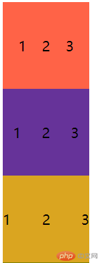
案例
div{display: flex;flex:1;width: 100px;height: 100px;}/* 平均对齐 */.d1{background-color: tomato;place-content: space-evenly;place-items: center;}/* 分散对齐 */.d2{background-color: rebeccapurple;place-content: space-around;place-items: center;}/* 两边对齐 */.d3{background-color: goldenrod;place-content: space-between;place-items: center;}<div class="d1"><span>1</span><span>2</span><span>3</span></div><div class="d2"><span>1</span><span>2</span><span>3</span></div><div class="d3"><span>1</span><span>2</span><span>3</span></div>
更多相关文章
- 第五课--位置布局
- android:layout_alignParent 布局相对于父布局的位置
- Android(安卓)ApiDemos示例解析(139):Views->Layouts->Baseline-
- gravity与layout_gravity的区别
- Android设置一个按钮右对齐
- 改善android性能工具篇【zipalign】
- Android-布局相关难点特性讲解
- android常用布局设置
- Android中文API(142) —— Gravity