flex的属性描述
16lz
2022-01-19
flex的概念
- flex是表示一个弹性盒子,是css的布局方式
- 成为弹性盒子时有主轴和交叉轴之分,也就是x轴和y轴。
flex的作用
- 当一个盒子的display属性设置为flex的时候,盒子会成为一个弹性盒子。成为行内块元素
flex主要的属性
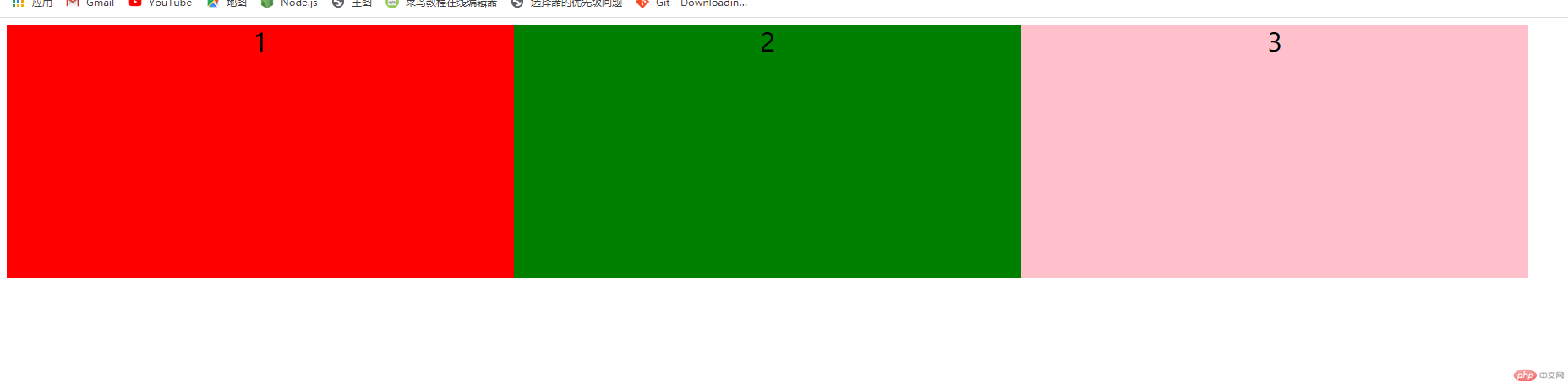
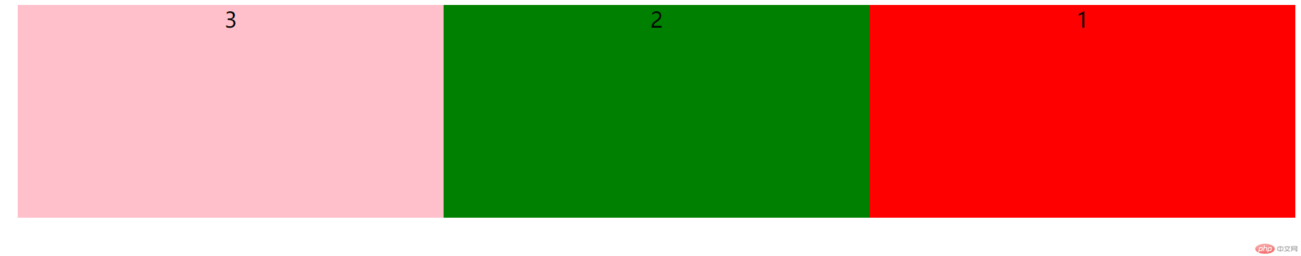
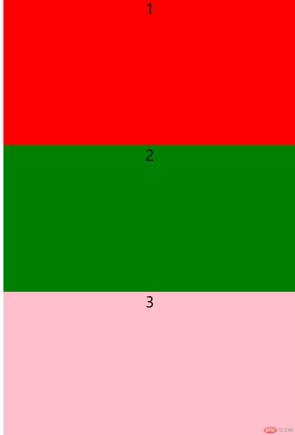
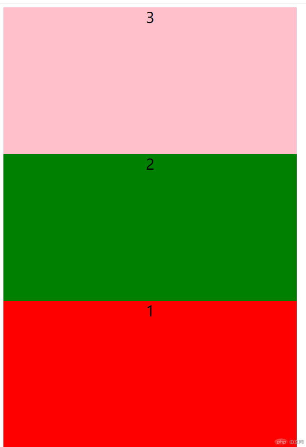
- 主轴方向:flex-direction
- flex-direction:row 水平向右(默认)
- flex-direction:row-reverse 水平向左
- flex-direction:column 垂直向下
- flex-direction:column-reverse 垂直向上
案例演示
<!DOCTYPE html><html lang="en"><head><meta charset="UTF-8"><title>flex相关属性</title><style type="text/css">html{font-size:10px;}.container{display: flex;/*把项目当成一个整体,水平向右显示它是默认行为*/flex-direction:row;/*flex-direction:row-reverse;*//*flex-direction:column;*//*flex-direction: column-reverse;*/}.header{width:60rem;height:30rem;background-color:red;justify-content: flex-end;}.main{width:60rem;height:30rem;background-color:green;justify-content: flex-end;}.footer{width:60rem;height:30rem;background-color: pink;}</style></head><body><div class="container"><div class="header">1</div><div class="main">2</div><div class="footer">3</div></div></body></html>
效果图依次为
主轴对齐方式
- 属性为:justify-content
- 取值有五种分别是:
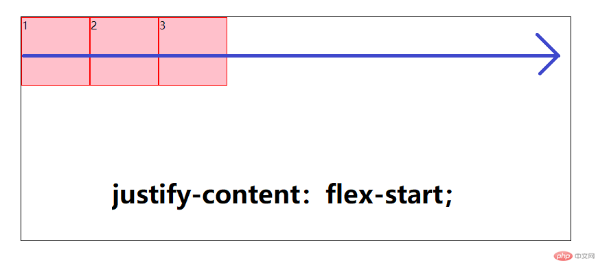
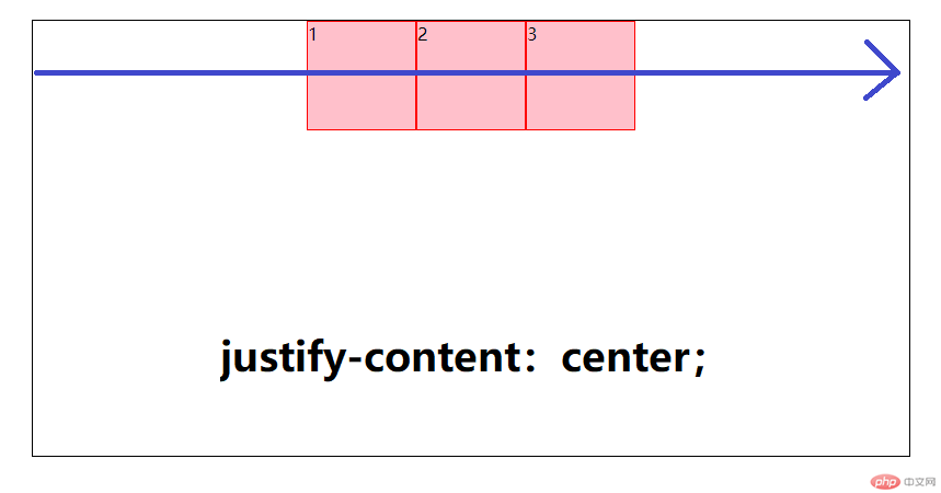
- justify-content:center;(居中对齐)
- justify-content:flex-start:(向主轴的开始位置对齐)
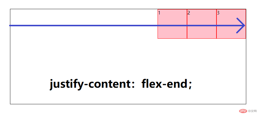
- justify-content:flex-start:(向主轴的结束位置对齐)
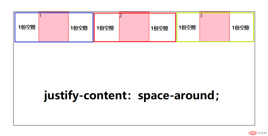
- justify-content:space-around(让空白环绕盒子显示)
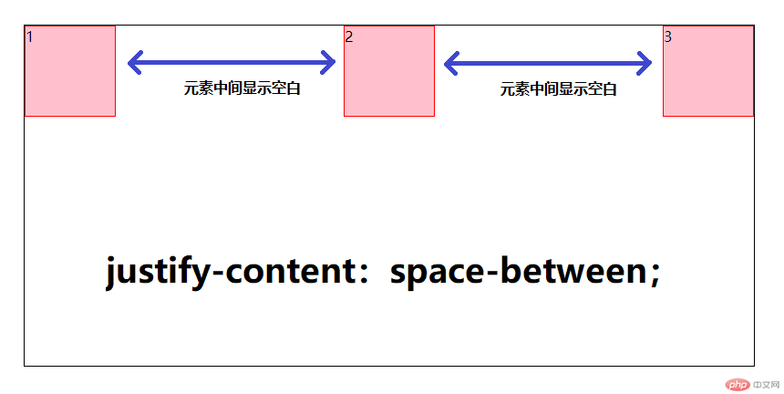
- justify-content:space-between(让空白只在盒子之间显示)
案例
<!DOCTYPE html><html lang="en"><head><meta charset="UTF-8"><title>flex相关属性</title><style type="text/css">html{font-size:10px;}.container{display: flex;justify-content: space-between;justify-content: space-around;justify-content: center;justify-content: flex-start;justify-content: flex-end;border:1px solid #000}.header{width:20rem;height:30rem;background-color:pink;text-align: center;font-size:3rem;border:1px solid red;}.main{width:20rem;height:30rem;background-color:pink;text-align: center;font-size:3rem;border:1px solid red;}.footer{width:20rem;height:30rem;background-color: pink;text-align:center;font-size:3rem;border:1px solid red;}</style></head><body><div class="container"><div class="header">1</div><div class="main">2</div><div class="footer">3</div></div></body></html>
效果图
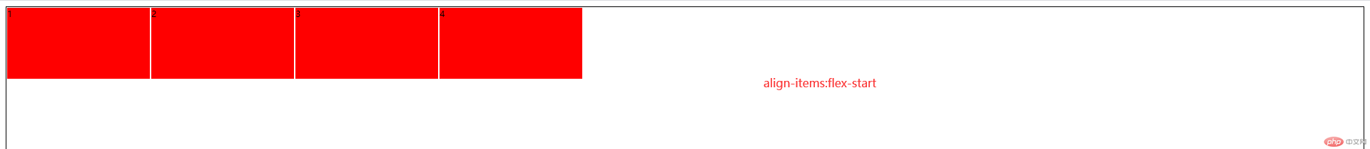
单行侧轴对齐方式
- 俗称的y轴
属性为
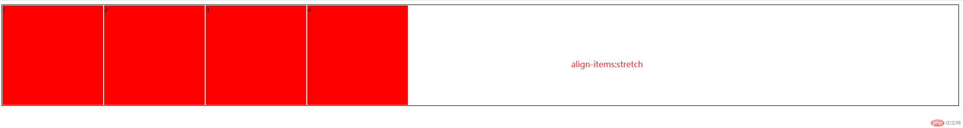
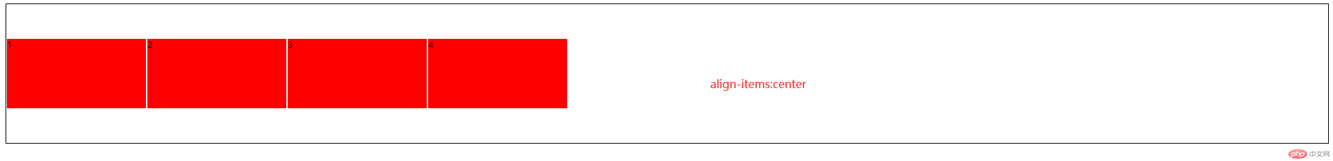
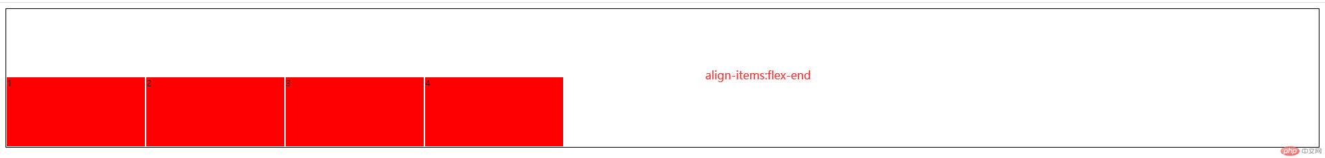
- align-items
属性值:
- align-items:flex-start:向侧轴的开始位置对齐
- align-items:flex-end:向侧轴的结束位置对齐
- align-items:center:居中对齐
align-items:stretch:让子盒子的高度拉伸显示(默认值)
注意:当给盒子内的子元素设置 align-items:stretch属性的时候不能给它盒子内部的子元素设置高度
<!DOCTYPE html><html lang="en"><head><meta charset="UTF-8"><title>flex容器子元素相关属性</title><style type="text/css">html{font-size: 10px;}.container{/* 转为flex布局,这个元素就叫flex容器,弹性容器 */display: flex;height: 20rem;border: 1px solid #000;align-items: stretch;/* align-items: flex-end;align-items: flex-start;*//*align-items: center;*/}.container>.item{width:20rem;/*height: 10rem;*/background-color: red;border:1px solid white;}</style></head><body><div class="container"><div class="item">1</div><div class="item">2</div><div class="item">3</div><div class="item">4</div></div></body></html>
<!DOCTYPE html><html lang="en"><head><meta charset="UTF-8"><title>flex容器子元素相关属性</title><style type="text/css">html{font-size: 10px;}.container{/* 转为flex布局,这个元素就叫flex容器,弹性容器 */display: flex;height: 20rem;border: 1px solid #000;/*align-items: stretch;*//*align-items: flex-end;*/align-items: flex-start;/*align-items: center;*/}.container>.item{width:20rem;height: 10rem;background-color:red;border:1px solid white;}</style></head><body><div class="container"><div class="item">1</div><div class="item">2</div><div class="item">3</div><div class="item">4</div></div></body></html>
效果图
更多相关文章
- RelativeLayout相对布局中的属性
- android 动画
- Android开发——Android搜索框架(二)
- [Android] ACTION_GET_CONTENT与ACTION_PICK的区别
- Android(安卓)UI系列 - 布局 - 目录
- android Manifest.xml选项-android:ConfigChanges
- linearLayout 和 relativeLayout的属性区别
- Android(安卓)属性动画(Property Animation) 完全解析 (下)
- Android修改字体样式